Original Magazine Spread
I chose this article from the Via Magazine, March-April 2020 edition, page 20. It is written by Trina Enriquez with the photograph taken by Nick Lake. The link to view this article can be found here: https://www.nxtbook.com/nxtbooks/aaavia/viaoregon_20200304/index.php#/p/20
This picture and the article appealed to me because I love waterfalls, and this magazine has many familiar places featured. The raw power of the waterfall is in contrast with the comfort I feel when I hear the roar and I like to learn and visit about all of the local falls.
Typography Identified

The headings on the first page, and the headings on the second page are in Sans Serif. Sans Serif is a font that means “without” the ends of the strokes. For example, a lowercase f would not have any bottom horizontal line. Sans Serif looks very clean without any extra flourishes and sends a strong message. It is direct. The typeface is always “monoweight” meaning all the strokes are even and have the same thickness from the top of the letter to the bottom. Although it is “monoweight”, a variety of weights from very bold to very thin and light. It is relatively new compared to Oldstyle.

The quotations in the columns are Oldstyle and is used for lots of text, especially is smaller size. Oldstyle is based on hand lettering and includes serif’s or a small stroke at the end of the main stroke. For example, the short angled stroke at the top of the lowercase f or they curved strokes called “bracketing” at the end of the s. It also has varying weight from thick to thin in the stroke itself. It is very easy to read despite the extra strokes.

Typography Contrasts

The larger text including the title of the series, “On the Road”, and the first and second page paragraph headers are Sans Serif and are large font size. The smaller lead sentence is also Sans Serif but has a much thinner weight and the spacing or kerning between the characters is slightly larger.
This contrasts with the quotations below in Oldstyle. It immediately tells me I have more text to read, so it is smaller and easier to digest. The amount of text has two columns on the first page, and three on the second. My eyes are drawn to the quotes with the familiar Oldstyle, but the name of the person giving the quote is in Sans Serif and is in all caps. The size of the text also contrasts, as I leave the top of the page with the most important text in large font, I am drawn down to read the rest of the columns. The user giving the quote is listed, but the importance is what they are saying, not so much who said it.
Photograph Analysis

The photographer uses the Rule of Thirds by having the waterfall itself take up the top two-thirds of the picture. The person standing in the middle horizontal grid, just slightly off-center adds perspective to the size of the waterfall. The falling water itself is the leading lines down to the person standing as well as the log the person is standing next to. The depth of field is focused on the red jacket on the man’s back which is sharp and clear and the waterfall itself is slightly out of focus.
Alternative Photos


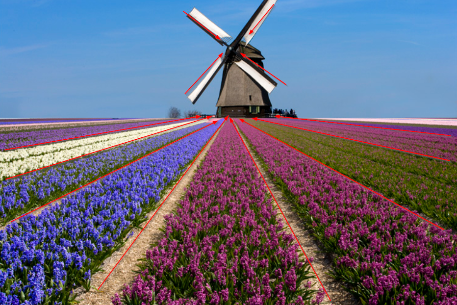
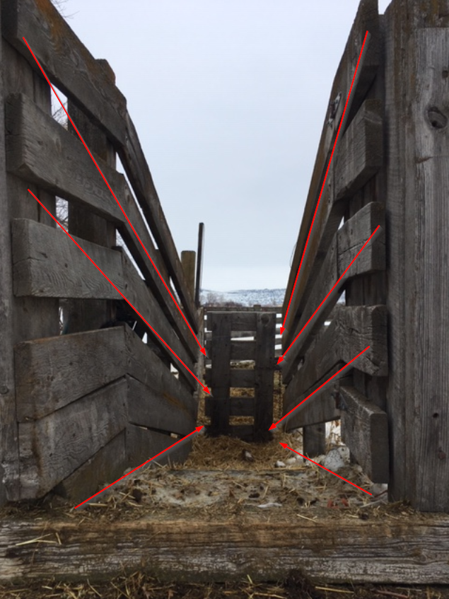
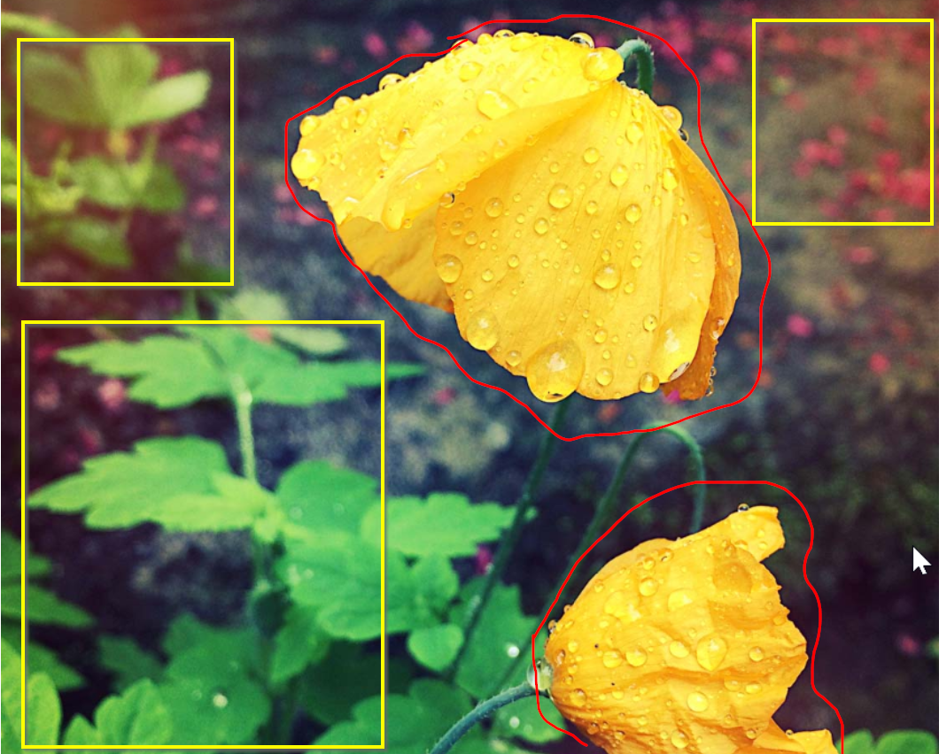
Here are my three images that could be swapped in place.
Although I didn’t have a person standing in front of the Idaho Falls, I used the surrounding scenery to help give the perspective. For example, showing the water itself as a leading line with the stacked rocks still draws the eye from top to bottom. The depth of field in pictures has the focus on the waterfall itself with the foreground slightly out of focus for the first picture and for the second and third, the focus is on objects around the water. I also used the overhanging trees to frame the picture. Finally, the waterfall is in the top or bottom of the picture instead of centered.
Conclusion
Overall design of the magazine article pleasantly lead me throughout. When I saw this article for the first time, my eye was instantly drawn to the top left hand side of the spread. The bold white face of Sans Serif made the simple yet powerful statement that I would see things while traveling. My eyes then traveled down the water to see the person in the focus in front of the waterfall. This image was the clearest and I could identify being that person standing in front. The quotation bubble in green grabbed my attention and the next page was easy to follow again from top to bottom with the heavier weight Sans Serif typeface with the most important information down to the Oldstyle typeface of the quote, to the thin weight of the name of the person giving the quote. The simple design never distracted from the beauty of the waterfall picture.


