Reversed Engineering Post – Typography
Introduction –
I am using my company’s website as my example. NAVEX Global is a software company specializing in ethics & compliance. This is a screenshot from www.navexglobal.com and was created by our amazing Marketing team who at the time of this was headed by Chris Morton, Director of Marketing. I am always proud to direct our clients to the corporate website because its modern design and easy to use navigation.
The use of different font types attracts attention as well as the white space surrounding the main mission statement in white. The green “Get Started” buttons beg to be clicked on.

First Font Style – OldStyle
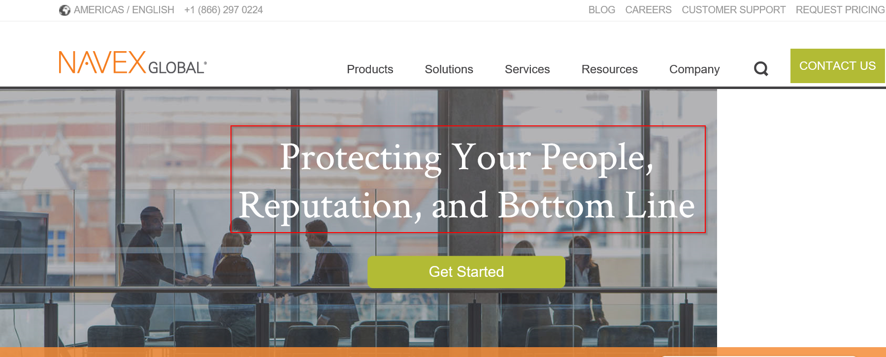
The white mission statement or tag line is right aligned on the website. The font is Oldstyle and is very professional with the stroke marks mimic brush marks. This font is easy to read yet is distinguished.
Second Font Style – Sans Serif

The smaller type surrounding the main tag line and the menu items at the top are in Sans Serif. The mono weight is very simple and even from black to white are distinctive without any serifs. This font seems to be very common in digital formats, and are used many times over in the website. The logo in the top left actually includes a decorative style using a dot instead of a line for the letter A.
Contrast between the fonts

The serifs of the Oldstyle have an elegance to the letters showing to me that the tag line should draw my attention first. It’s professional look elevates the message. The white color against the picture background make it stand out without overwhelming the reader. The diagonal stress on the o’s are noticeable at this size of font.
The smaller Sans Serif font shows contrast by having the same weight of the letters. Without the serif’s there is less emphasis on reading, and more on invitation of clicking. The action tabs with the green and with text makes it easy to see where to click for more information. The black menu items at the top still offer information if needed, but the eye is drawn to the green.
The logo showing the NAVEX in decorative style and in orange helps draw attention to the name. Global is used in many company’s names, but NAVEX is unique and memorable.
Conclusion –
The different font styles show a mature design style intended to draw the reader in. The designer is not afraid to contrast Oldstyle with the Sans Serif font. The use of colors to instruct users to find more information is clever.