Comm 111 April 2019 · Photography

My Favorite Hobby I Need Help With – Photography

My dream in high school was to capture the perfect story on black and white film. This one picture would convey all of the emotions I felt deeply at the time; wanting to be admired, yearning for wisdom, and of course making it big financially! In my Photography 101 class, I learned the same rules thirty years ago for taking a great picture of rule -of-thirds, leading lines, and depth-of-field. As l looked through my photos, I realized that I needed the refresher and lots of practice!

Rule of Thirds – 

Professional (those making money)

Photo by Steven Olmstead Photography
https://travel.usnews.com/Jackson_Hole_WY/Things_To_Do/Grand_Teton_National_Park_62135/

Amateur (me not making money)

Mount Hood – taken by Maria Poole from an airplane window

Let’s take a look at how the rule of thirds apply to each….


This picture of the Grand Tetons is stunning! The first rule that came to mind was the rule of thirds. Drawing just the horizontal lines across the picture, the mountains, trees and reflection are all within a third of the picture. A great way to focus on each separately while enhances overall.

The focal points of tree line and the bottom of the mountains is where the top vertical and horizontal lines meet, and the beginning of the reflection is found where the bottom lines meet.

In my photo, the top of Mount Hood is at the intersection of the lines, and it is easy to follow down the mountain to the clouds. Each element of sky, snow-covered mountain, and clouds are seen.

Leading Lines

Professional (those making money)

Photo by Jim Zuckerman
https://www.photovideoedu.com

Amateur (me not making money)

Amsterdam with friends (although I loved this picture for the lines, I realized it was very blurry so felt I needed to take another picture for my example) Photo by Maria Poole
Loading Chute by Maria Poole

The elements of leading lines are in each.

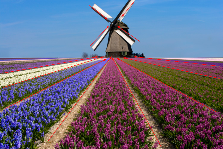
The rows of flowers naturally take our eye to the windmill. This also gives us a feeling of depth perception showing distance. The windmill arms also help guide our eye to the tower of the windmill. Having the lines also be in contrasting colors captures attention.

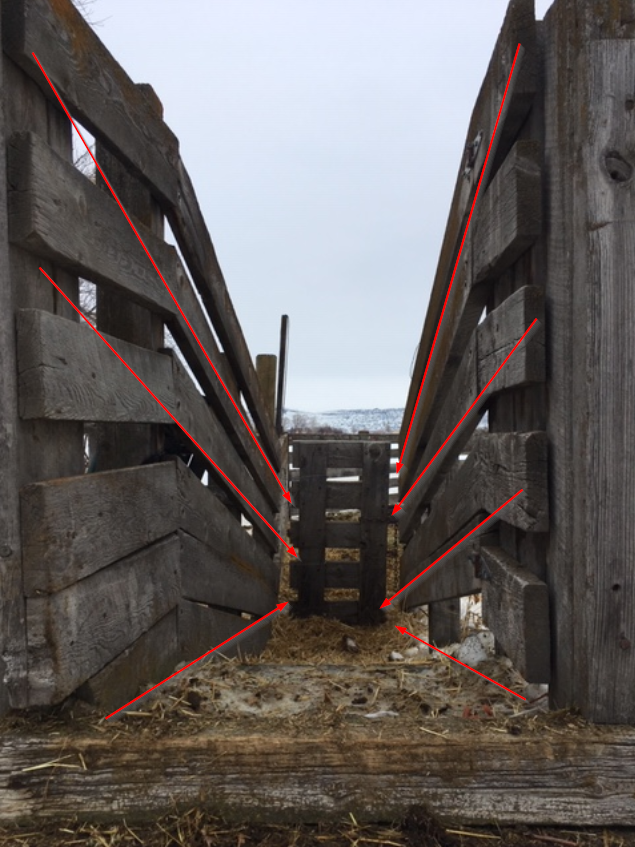
The loading chute is normally not very interesting, it is full of straw, and cow pies. I realized that it does become much more striking if I took the picture from the top looking down to the gates. The lines of the fence naturally draw your eye down to the center. The spaces on the slates of the center gate contrast nicely with the diagonal lines.

Depth of Field

Professional (those making money)

Photo by Rob Dunsfield
https://iphonephotographyschool.com/focus-tips/

Amateur (me not making money)

Plant Photo by Maria Poole

Let’s look closer at what is in and out of focus…

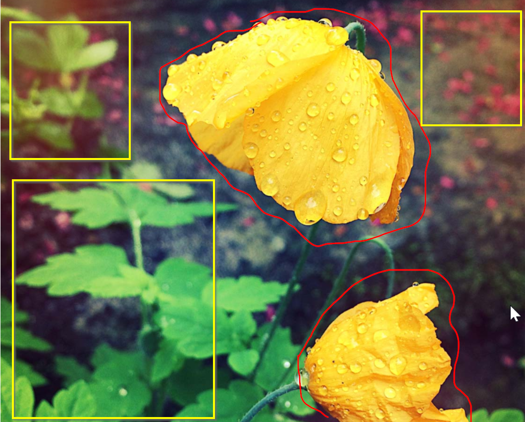
The focus is on the yellow poppies and the individual drops of rain on the petals. This enhances the fragility of the drops that can slide off at any minute. By showing these instead of the background behind, we can enjoy the uniqueness of each different shaped drop.

I wanted to focus on the pink spots on this plant to show the variegated colors. The rest of the plants and my living room beyond were not what I wanted to highlight, so purposely blurred. The individual leaves shows how thick and becoming this small plant really is.

What I learned besides needing help – 

There are many, many other elements of photography including lighting, framing, and general composition. However, with just these three, I can get the help I need! The rule of thirds is what I think of while pointing my IPhone at scenery. The leading lines is a great way to show exactly the element in the picture I want people to see. I learned something new with my IPhone, too, being able to have depth of field to make small details more interesting.

Comm 111 April 2019 · Design · Reverse Engineer

Varied Font Styles Draw Attention

Reversed Engineering Post – Typography

Introduction –

I am using my company’s website as my example. NAVEX Global is a software company specializing in ethics & compliance. This is a screenshot from www.navexglobal.com and was created by our amazing Marketing team who at the time of this was headed by Chris Morton, Director of Marketing. I am always proud to direct our clients to the corporate website because its modern design and easy to use navigation.

The use of different font types attracts attention as well as the white space surrounding the main mission statement in white. The green “Get Started” buttons beg to be clicked on.

First Font Style – OldStyle

The white mission statement or tag line is right aligned on the website. The font is Oldstyle and is very professional with the stroke marks mimic brush marks. This font is easy to read yet is distinguished.

Second Font Style – Sans Serif

The smaller type surrounding the main tag line and the menu items at the top are in Sans Serif. The mono weight is very simple and even from black to white are distinctive without any serifs. This font seems to be very common in digital formats, and are used many times over in the website. The logo in the top left actually includes a decorative style using a dot instead of a line for the letter A.

Contrast between the fonts

The serifs of the Oldstyle have an elegance to the letters showing to me that the tag line should draw my attention first. It’s professional look elevates the message. The white color against the picture background make it stand out without overwhelming the reader. The diagonal stress on the o’s are noticeable at this size of font.

The smaller Sans Serif font shows contrast by having the same weight of the letters. Without the serif’s there is less emphasis on reading, and more on invitation of clicking. The action tabs with the green and with text makes it easy to see where to click for more information. The black menu items at the top still offer information if needed, but the eye is drawn to the green.

The logo showing the NAVEX in decorative style and in orange helps draw attention to the name. Global is used in many company’s names, but NAVEX is unique and memorable.

Conclusion –

The different font styles show a mature design style intended to draw the reader in. The designer is not afraid to contrast Oldstyle with the Sans Serif font. The use of colors to instruct users to find more information is clever.

Comm 111 April 2019 · Design · Reverse Engineer

M&M’s Yellow by Design

Introduction

This M&M Yellow Peanut advertisement was listed in the April 2014 issue of Ebony.  I found this on Google images, and this ad was part of an article called “Representations of American Culture in Food Advertisements in Mainstream, Latina, and African-American Magazines”. The photo credit in the image is by Martin Wonnacott.

Proximity

This ad grouped together the tag line of “A Nut Above the Rest” and the description close to the images. The quote was centered about Yellow, the peanut M&M character.

Alignment

The lines of the text are divided into columns, with using center alignment for the quote, and left-aligned for the description column.

Repetition

The use of all one color, with slightly different tints and shades add to the theme. The image of the peanuts that spread across the full bottom help reinforce the type of M&M.

Contrast

The use of the white quote against the yellow background and tying it together with the white of the gloves and “m” on the front make a striking image. The black writing on the right is different to show it is not part of the quote.

Conclusion

This ad was very pleasing to look at. The use of a dominant color reinforced the character, and the play of cartoon with the real images of peanuts made it seem this character was real. Overall, the contrast was simple, and the alignment easy to read.